Page heading
Lorum Ipsum pair.Lorum ipsum
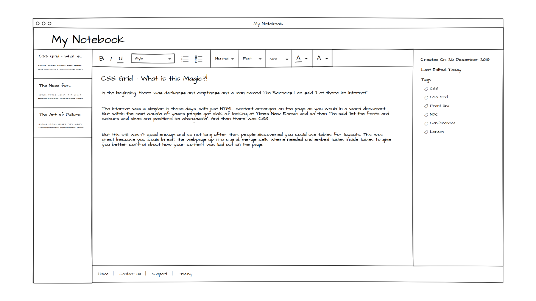
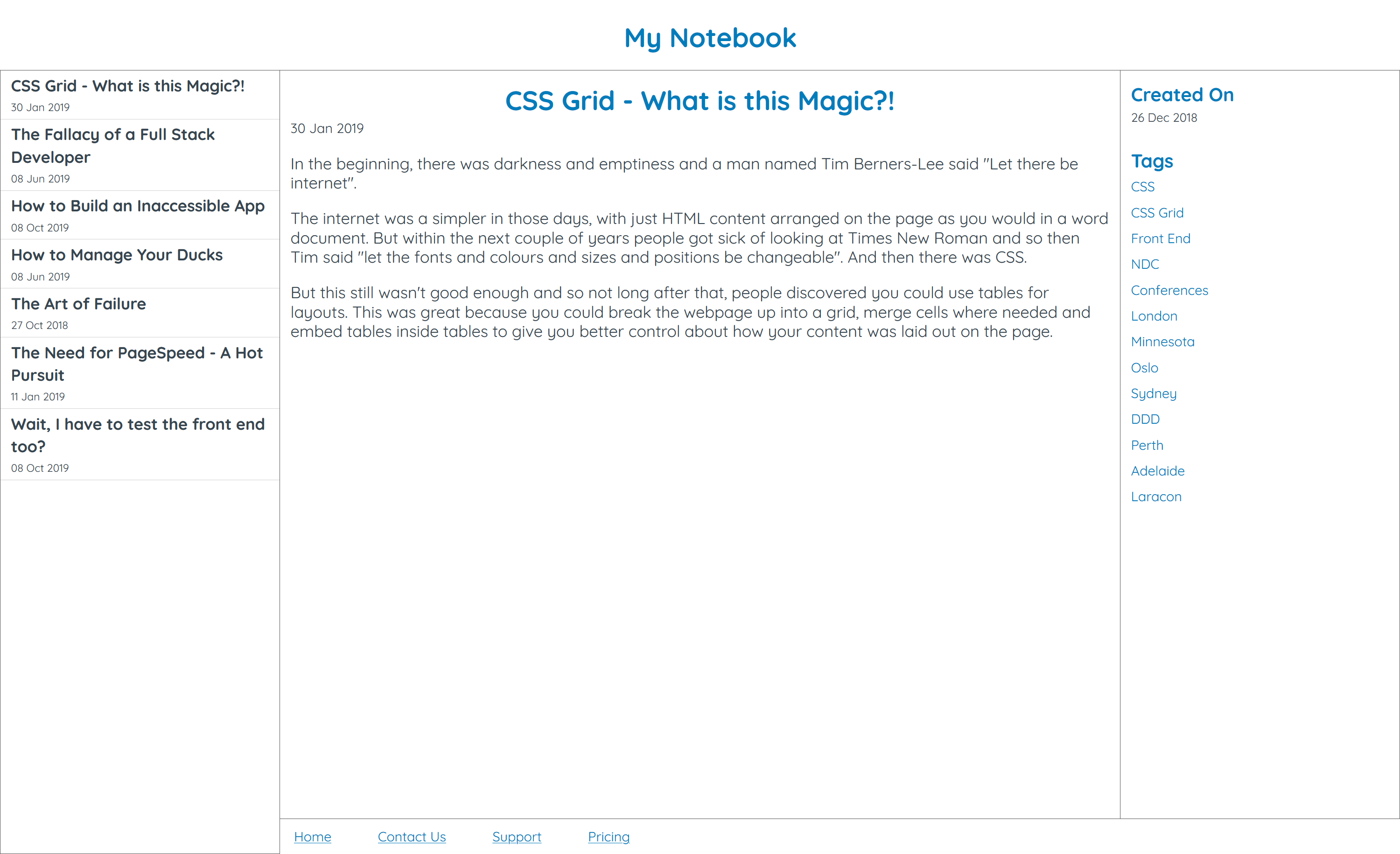
CSS Grid
What is this Magic?!
CSS Grid
What is this Magic?!


CSS Grid
What is this Magic?!
Everything there is online about W3 is linked directly or indirectly to this document, including an executive summary of the project, Mailing lists Policy , November's W3 news ,Frequently Asked Questions .
								My Website


								Home


									Menu link

									Menu link


									Page heading
									Lorum Ipsum pair.

									Lorum ipsum


								Copyright ©

My Website
Page heading
Lorum Ipsum pair.
Lorum ipsum
header {
height: 100px;
padding: 10px;
}
nav {
clear: both;
height: 25px;
padding: 15px;
}
main {
clear: both;
overflow: hidden;
}
aside {
float: left;
padding: 10px;
}
article {
float: left;
padding: 10px;
width: 55%;
}
footer {
clear: both;
height: 20px;
}
.parent {
clear: both;
overflow: hidden;
}
.child {
float: left;
width: 100%;
@media (min-width: 500px) {
margin-right: 2%;
width: 49%;
&:nth-child(2n) {
margin-right: 0;
}
&:nth-child(2n + 1) {
clear: both;
}
}
@media (min-width: 800px) {
clear: none !important;
margin-right: 1% !important;
width: 32.6666667%;
&:nth-child(3n) {
margin-right: 0 !important;
}
&:nth-child(3n + 1) {
clear: both !important;
}
}
}
My Website
Page heading
Lorum ipsum pair.
Lorum ipsum
header {
height: 100px;
}
nav {
display: flex;
align-items: center;
height: 30px;
padding: 10px;
}
main {
display: flex;
}
aside {
width: 20%;
nav {
flex-wrap: wrap;
}
}
article {
padding: 10px;
width: 55%;
}
footer {
height: 20px;
padding: 10px;
text-align: center;
}
.parent {
display: flex;
width: 102%;
margin: -1%;
}
.child {
flex: 1 1 auto;
margin: 1%;
}
My Website
Page heading
Lorum ipsum pair.
Lorum ipsum
body {
display: grid;
grid-template-columns: repeat(5, 1fr);
}
header {
grid-column: 1 / -1;
}
nav {
grid-column: 1 / -1;
}
main {
grid-column: span 3;
}
footer {
grid-column: 1 / -1;
}
								My Website


								Home


									Menu link

									Menu link


									Page heading
									Lorum Ipsum pair.

									Lorum ipsum


							Copyright ©
						body {
							display: grid;
							grid-template-columns: repeat(5, 1fr);
						}

						header {
							grid-column: 1 / -1;
						}

						nav {
							grid-column: 1 / -1;
						}

						main {
							grid-column: span 3;
						}

						footer {
							grid-column: 1 / -1;
						}
Grid ≠ Tables
PS. Tables aren't bad, they're misunderstood
Grid helps us
write semantic HTML
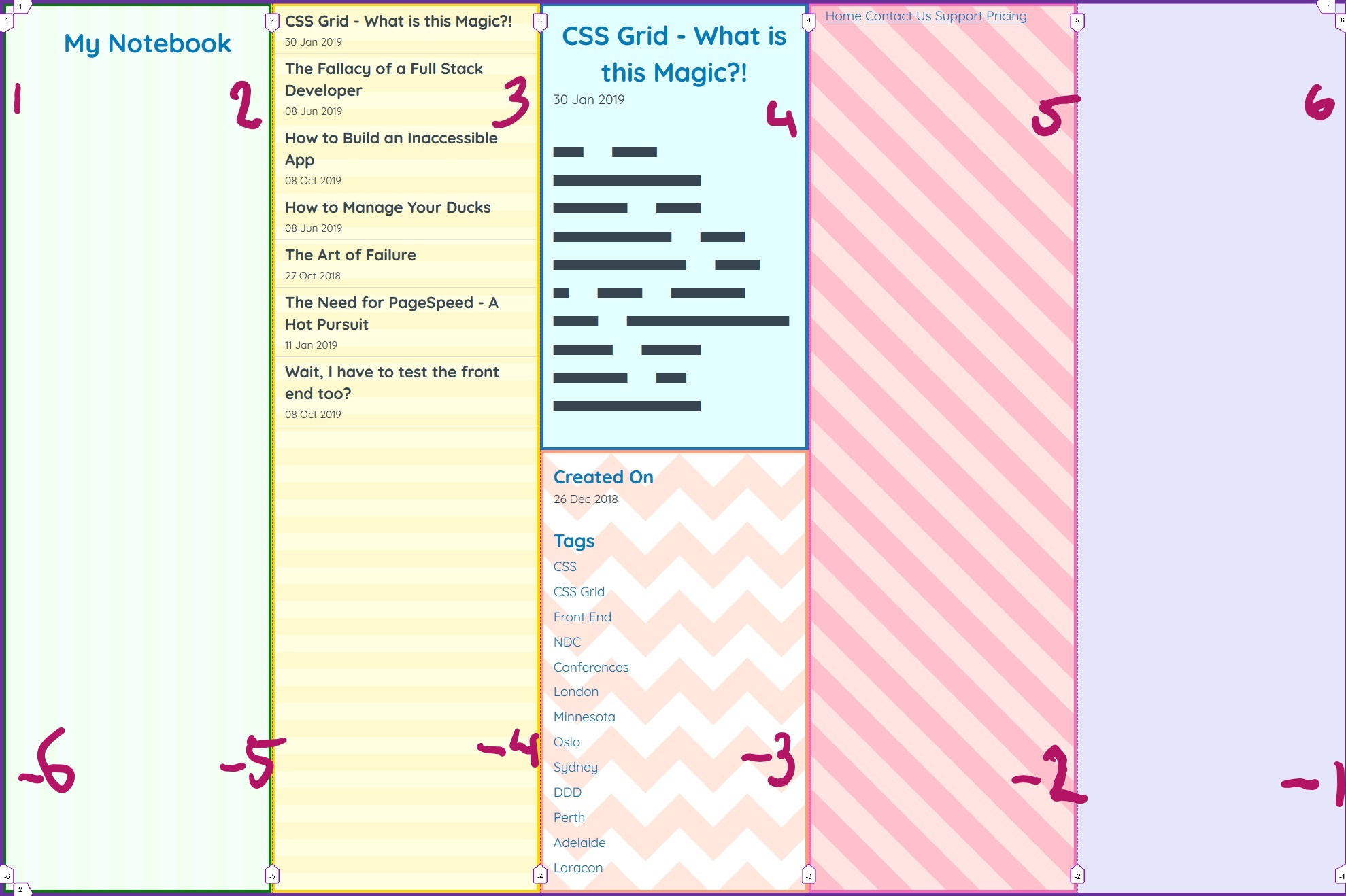
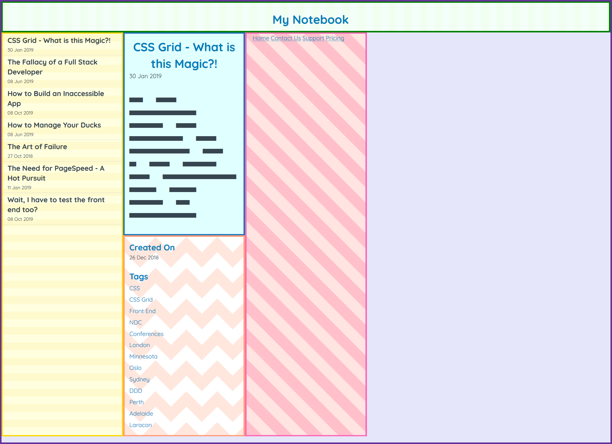
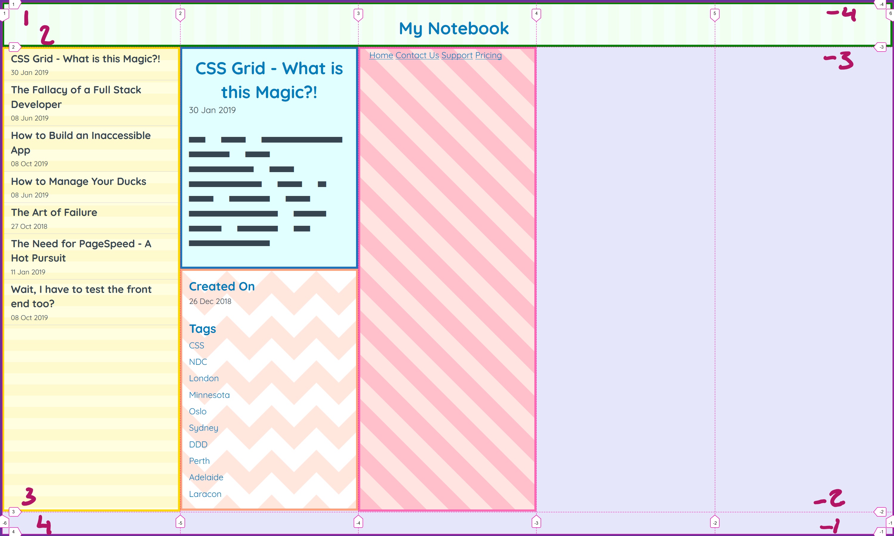
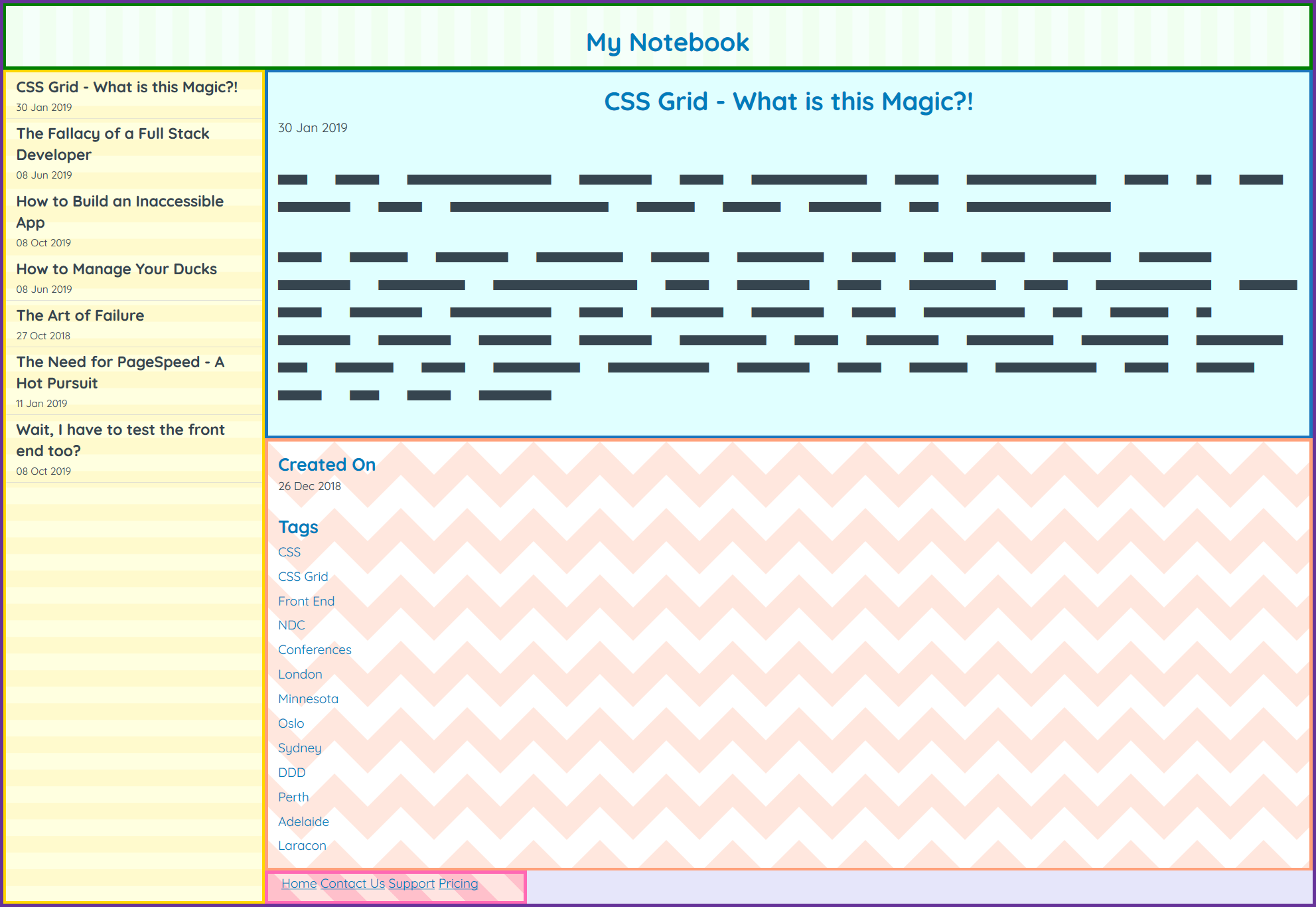
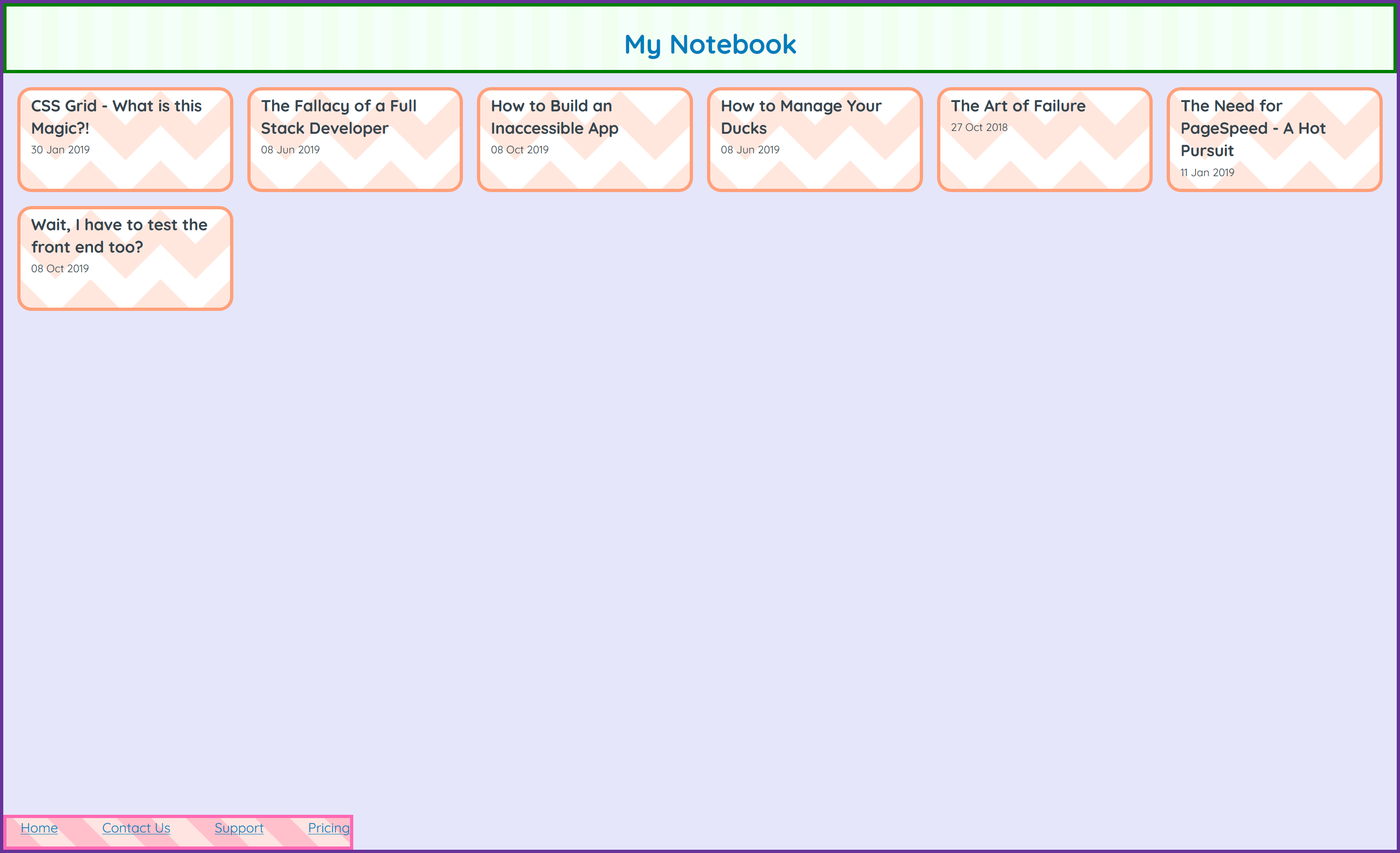
My Notebook
Note 1
There is a note written here...
					body {
						display: grid;
					}
						body {
							display: grid;
						}

						body {
							display: grid;
							grid-template-columns: 200px 200px 200px 200px 200px;
						}
						body {
							display: grid;
							grid-template-columns: repeat(5, 200px);
						}
repeat(number of times, size)
repeat(3, 200px)
200px 200px 200px
repeat(2, 10px 20vw)
10px 20vw 10px 20vw
						body {
							display: grid;
							grid-template-columns: repeat(5, 20%);
						}
						body {
							display: grid;
							grid-template-columns: repeat(5, 1fr);
						}
The fr unit
						grid-template-columns: 100px 1fr 50px 2fr;
						grid-gap: 20px;
1fr = 100px
						/*grid-template-columns: 100px 1fr 50px 2fr;*/
						grid-template-columns: 100px 100px 50px 200px;
						grid-gap: 20px;
						body {
							display: grid;
							grid-template-columns: repeat(5, 1fr);
						}
						body {
							grid-template-columns: repeat(5, 1fr);
						}
						body {
							display: grid;
							grid-template-columns: repeat(5, 1fr);
							grid-template-rows: 100px 1fr 50px;
						}
						body {
							grid-template-columns: repeat(5, 1fr);
							grid-template-rows: 100px 1fr 50px;
						}

						header {
							grid-column-start: 1;
						}
						header {
							grid-column-start: 1;
							grid-column-end: -1;
						}
						header {
							/*grid-column-start: 1;
							grid-column-end: -1;*/
							grid-column: 1 / -1
						}
						header {
							grid-column: 1 / -1
						}
						header {
							grid-column: 1 / -1;
						}
						nav {
							grid-row: 2 / -1;
						}
						nav {
							/* grid-row: 2 / -1; */
							grid-row: span 2;
						}

						nav {
							grid-row: span 2;
						}
						main {
							grid-column: span 4;
						}
						main {
							grid-column: span 4;
						}
						footer {
							grid-column: span 4;
						}
						footer {
							grid-column: span 4;
						}
						body {
							grid-template-columns: repeat(5, 1fr);
							grid-template-rows: 100px 1fr 20px;
							grid-template-areas:
							  'header header header header header'
							  'nav    note   note   note   note'
							  'nav    footer footer footer footer';
						}
						header {
							grid-area: header;
						}

						nav {
							grid-area: nav;
						}
						main {
							grid-area: note;
						}

						footer {
							grid-area: footer;
						}


Basic layout ☑️
7 lines of CSS 🤯
						main {
							display: contents;
						}
Note Title
Note Content
Note Title
Note Content
						main {
							grid-area: note;
							display: contents;
						}
						main {
							grid-area: note;
							display: contents;
						}
						body {
							grid-template-areas:
							  'header header header header header'
							  'nav    note   note   note   sidebar'
							  'nav    footer footer footer footer';
						}
						article {
							grid-area: note;
						}
						aside {
							grid-area: sidebar;
						}
display: contents
makes screen readers cry
Note Title
Note Content
Don't mess with the DOM
Subgrid to the rescue!
						body {
							grid-template-areas:
								'header header header header header'
								'nav    note   note   note   note'
								'nav    footer footer footer footer';
						}
						main {
							grid-area: note;
							/*display: contents;*/
							display: grid;
						}
						main {
							grid-area: note;
							display: grid;
						}
						main {
							display: grid;
							grid-template-columns: subgrid;
						}

						main {
							grid-template-columns: subgrid;
						}
							article {
								grid-column: span 3;
							}
								article {
									grid-column: span 3;
								}

So does Grid replace Flexbox?


Grid is awesome for layouts
Flexbox is awesome
for flowing content
Grid + Flex =
super CSS Layout duo

						footer nav {
							display: flex;
							justify-content: space-between;
						}

						footer nav {
							display: flex;
							justify-content: space-between;
						}
						grid-parent {
							justify-items: stretch;
							align-items: stretch;
						}
						grid-child {
							justify-self: stretch;
							align-self: stretch;
						}
						footer {
							justify-self: start;
						}
						footer {
							justify-self: start;
						}

						footer {
							justify-self: start;
							width: 300px;
						}

						footer {
							justify-self: start;
							width: 300px;
						}

						main {
						  grid-template-columns: repeat(10, 300px);
						}
						main {
						  grid-template-columns: repeat(auto-fill, 300px);
						}
repeat(auto-fill, 100px)
auto-fill / auto-fit
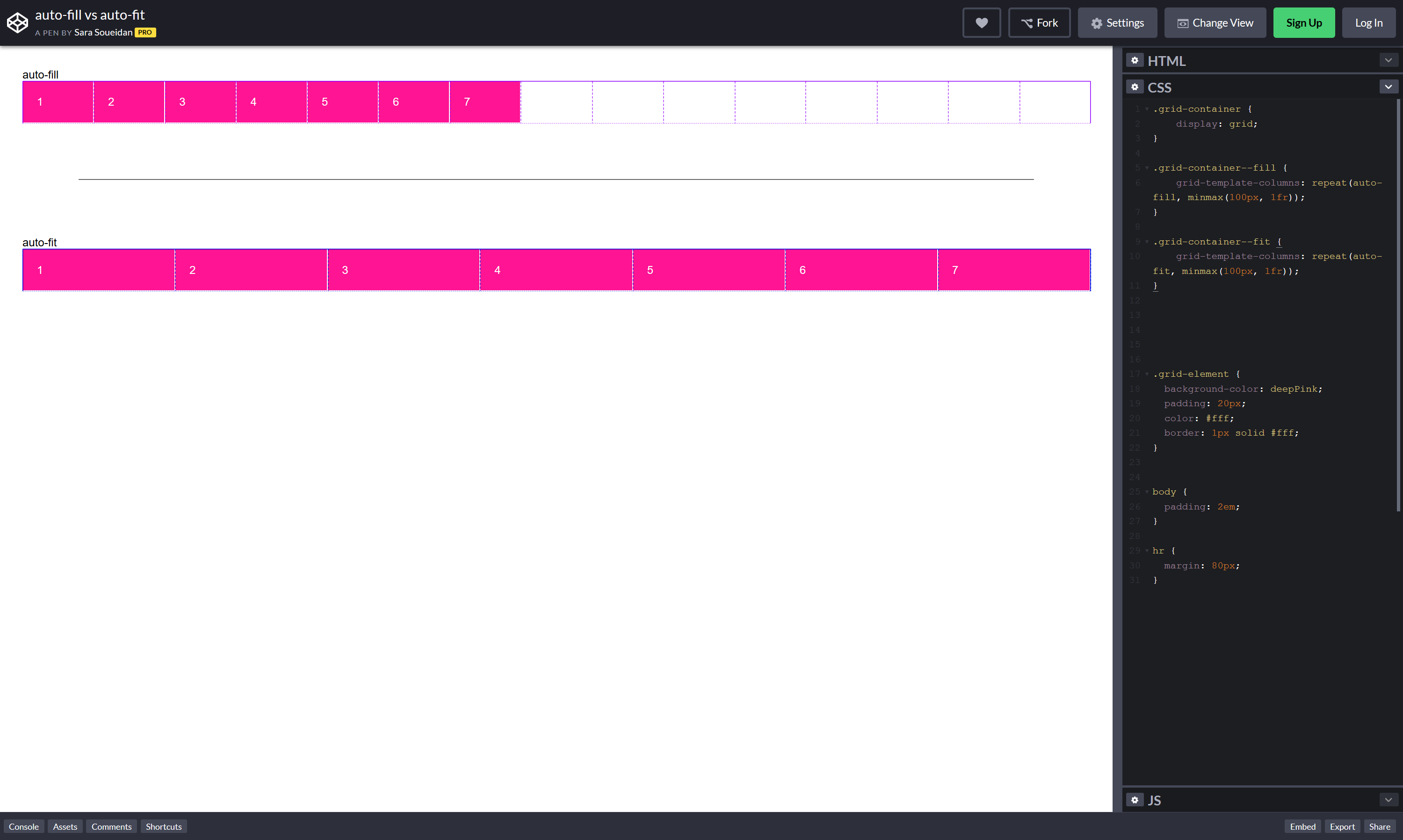
repeat(auto-fill, 100px)
						main {
							grid-template-columns: repeat(auto-fill, 300px);
						}
						main {
							grid-template-columns: repeat(auto-fill, minmax(300px, 1fr));
						}
minmax(100px, 20vw)
minmax(100px, 1fr)
minmax(1fr, 300px)
						main {
							grid-template-columns: repeat(auto-fill, minmax(300px, 1fr));
						}

						main {
							grid-template-columns: repeat(auto-fill, minmax(300px, 1fr));
						}

						main {
							grid-template-rows: repeat(auto-fill, 150px);
						}
						main {
							grid-template-rows: repeat(auto-fill, 150px);
						}

						main {
							grid-column-gap: 20px;
						}
						main {
							grid-column-gap: 20px;
							grid-row-gap: 20px;
						}
						main {
							/*grid-column-gap: 20px;
							grid-row-gap: 20px;*/
							grid-gap: 20px;
						}
						.parent {
							margin: -10px;
						}

						.child {
							margin: 10px;
						}
						.child {
							margin: 10px;
						}
						.child:nth-child(5n) {
							margin-right: 0;
						}
						.child:nth-child(5n+1) {
							margin-left: 0;
						}
						.child:nth-child(-n+6) {
							margin-top: 0;
						}
						main {
							grid-gap: 20px;
						}

Sound too good to be true?
Browser Support 😬
 57
57
 52
52
 10.1
10.1
 16
16
 10ish
10ish
94%
❌
71
❌
❌
🤣
21
28
6.1
12
10
98%
@supports
						@supports(css-property: value) {
							/*Insert code here*/
						}
						@supports(display: grid) {
							/*Code here*/
						}
						@supports(grid-template-areas: '.') {
							/*Code here*/
						}
						@supports(grid-template-areas: '.') {
							main {
								display: grid;
							}
						}
But...
But there's not enough support
95%
@supports
But we have to write a fallback
You've already got one 🤷♀
But we don't have time
You don't have to use
grid everywhere
But we'll have to maintain it
It's CSS.
No frameworks. Just CSS
Summing up:
CSS Grid is Awesome
The End


Thank You 👏
kapers.dev/f2c